Mapping Emotion: Fighting school closures with QGIS
At FOSS4G UK 2018, Ross McDonald gave an amazing talk in the cartography stream on visualizing school catchment areas. Little did I know at the time how relevant to my family this would prove.

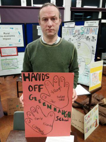
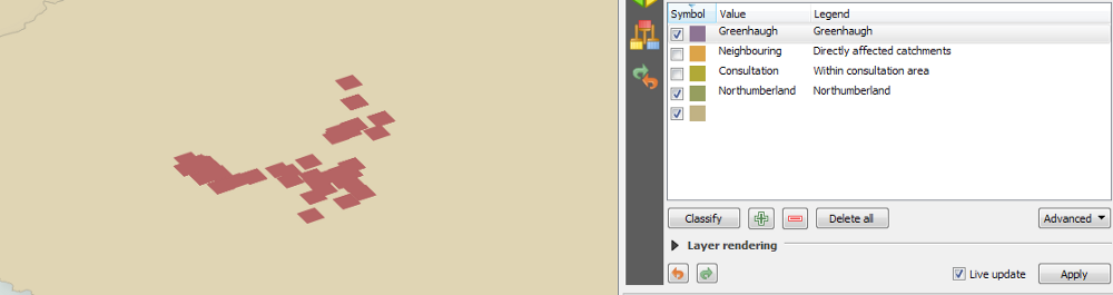
We live in deepest rural Northumberland, a few miles from the Scots border. We are truly lucky to live in the catchment area of the fabulous Greenhaugh First School. Our daughter is in her final year there, and we hope that her younger brother will also be lucky enough to attend. Greenhaugh has been the making of our daughter. During holidays, she looks forward to going back to school. It’s a magical place.
Northumberland County Council have started a consultation on schools in west Northumberland. In the consultation paper, they present three possible options. In all three options, Greenhaugh First School is proposed for closure. In addition, the middle school to which our daughter has just been accepted is also proposed for closure in at least one of these options.
Obviously, we are at our wits’ end, along with parents from across the whole region. A coalition quickly formed, and garnered support from figures as diverse as Allison Curbishley, Alan Davies, and Mike Figgis. I became a new member of that proud tribe, Angry People in Local Newspapers:
Everyone is doing what they can. I work with maps (a bit), so I wondered whether I could apply some of Ross’s techniques to this pressing and very personal matter.
The message
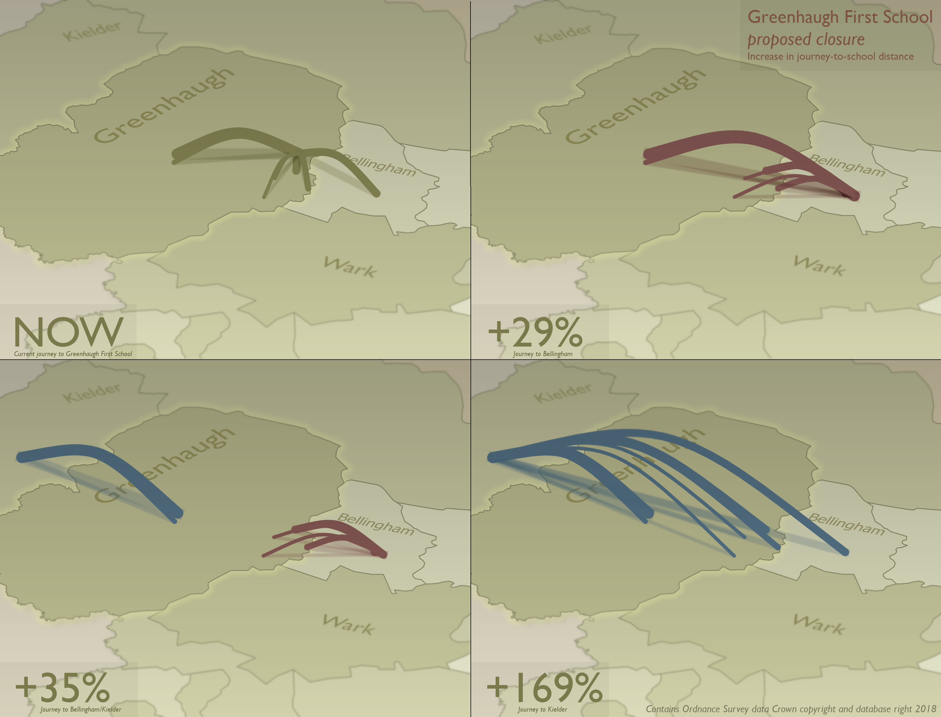
A great deal of raw data and argument will be employed in the case for Greenhaugh to stay open. I wanted to add something to appeal in another way — to capitalize on what is undeniably an emotional issue. Emotion is not always a weakness, but can be a great strength.
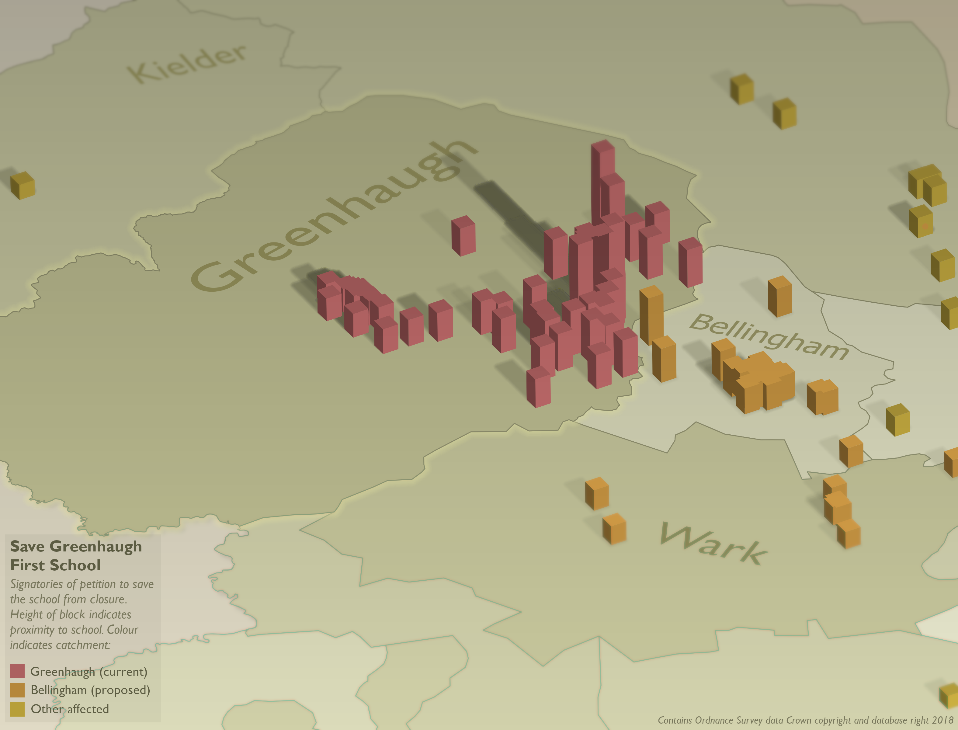
Two aspects of the case merited mapping: increased journey-to-school travel time, and strength of local support as indicated by signatories to the petition. The first of these could work with Ross’s techniques, while an approach to the second was initially unclear to me.
The data
The sources seemed quite clear: school locations and catchments for the first map, and the petition for the second.
Data is never simple. Catchments and school location are published on data.gov.uk and northumberland.maps.arcgis.com. However, some of these datasets seemed to be broken in both systems, and the catchments layer was a WMS, not a vector.
Thanks to help from Northumberland County Council’s LLPG team (shout-out to Tanya — thanks!), I was sent shapefiles within only an hour or two. They were exactly what I needed.
The petition requires a postcode from signatories. Plainly this needed geocoding. Though I work somewhere which gets postcode data as part of the Mapping Services Agreement, this is a personal matter, so I had to look elsewhere (I also wanted to match my open-source approach with open data wherever possible). I found an online geocoder, and wrestled with the PDF-only output from 38degrees (would CSV output kill them?). My infinitely more accomplished colleague Ed subsequently pointed out that there is an open version of OS CodePoint, which would have been much better, although the format in which it is distributed makes it a brute to work with.
The design
For the journey maps, I had Ross’s work to start from. I knew that I wanted to stress the visual impact, and that the parabola design was what I envisaged.
My belief is that the parabola as a design trope connotes a journey, and hence that it instinctively reduces the cognitive load for someone initially interpreting the map. I’d be interested to know if this bald assertion can be backed up.
The software
QGIS is simply amazing. I’m no mapper, but I have the utmost respect for those who are, and those who map with a design eye claim that QGIS’s cartographic tools are second-to-none. I’ve worked peripherally with QGIS for several years, and thought I probably knew enough to take the plunge and actually make a map myself.
QGIS 3 was released last month, so naturally I wanted to use it for this map. It’s billed as an “Early adopters’ version”, but I can wholeheartedly recommend it for production use. It’s been virtually rock-solid.

QGIS is open-source. It’s free. I’ve written recently about open-source software, so I won’t bore you here. However, I’m an avowed open-source zealot, so please colour your appreciation of this piece accordingly.
My belief was that while I could not achieve Ross’s rendered output built with 3D software, I could go a long way within QGIS itself. This is not an exercise in dogmatic support of QGIS, but has very real operational benefits.
Most digital creative processes involve two stages: production and post-production (the latter also known as post-processing or compositing). The production stage is where you work with the data and design. You can continually add to the data, and your work seamlessly updates. In this case, the key point is that everything remains as vectors. Rasterizing ties your work to a specific output resolution and freezes your data in time, decoupling both from their underlying data, so for maps of vector data, keeping them in vector format as long as possible is a key principle.
Post-production allows you to manipulate the whole image, and to pull elements from different sources together. In this case, it requires a rasterized image. The key point is that it is a discrete process. If you change your map, you will have to run the QGIS vector output back through your post-production pipeline. This is slow and repetitive, so keeping post-processing to a minimum is also devoutly to be wished.
The renderer
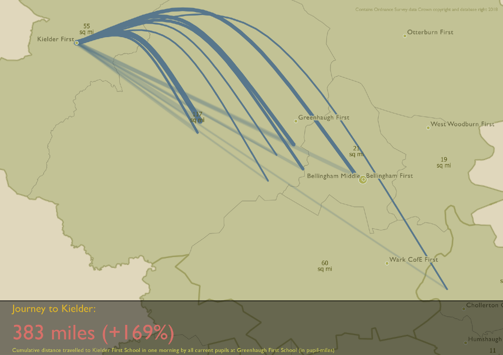
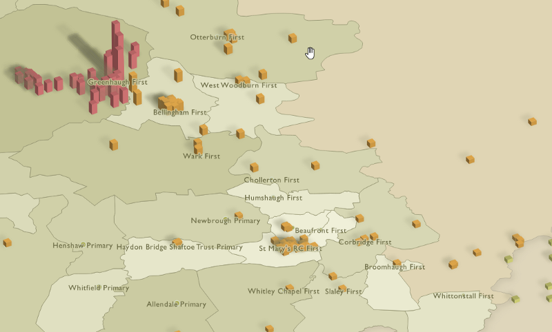
For the school journeys, I knew I wanted an origin-destination flow map. Using Ross’s parabolas, and lifting them into the Z axis, was what I had in mind.
QGIS 3 now supports full 3D geometry and rendering. I cannot stress enough that this is not what I wanted to use. I have a lot of sympathy with Dennis Bauszus’s assertion during his talk at FOSS4G UK 2018 that 3D has no place on a map — Charley Glynn also recommended exercising caution.
While many are excited at QGIS 3D, I tend to think that this will lend itself to producing 3D models, not maps. The aesthetic I have in mind is not terrain and surface models. It’s not hillshading and contours. It’s using the Z axis thematically, not topographically, to convey both an argument and an emotion.
Geometry generators
Digital mapping tends to involve working with three basic types of feature: points, lines, and polygons. QGIS allows you to style these features using a bewildering array of methods.
However, a fairly recent addition to these styling options is geometry generators. These start from the feature’s own geometry, and then allow you to build all sorts of designs by writing mathematical expressions to manipulate that geometry.
When geometry generators were first introduced to QGIS, I failed to see their potential. Boy, have I changed my mind now.
Origin-destination lines
The journeys to school is a point dataset. I needed lines, starting at the approximate pupil locations, and ending at Greenhaugh First School. Of course, I could simply have created a new table of line features linking the points to the school. However, as a coder, I hate duplication of data. If the point dataset were to change, I’d have to redraw the lines.
A geometry generator is the answer. The feature geometry remains untouched points, and the creation of the line is done programmatically in the layer style. My first problem was that the start and end points for the line are not in the same table. My colleague Ed helped me do my first table join in QGIS, and I now had the coordinates of the school as foreign fields in the pupils table.
I subsequently discovered that I didn’t need to join the tables. There is a QGIS expression function which retrieves a single feature from another table:
get_feature(
  Map_Layer,
  Field,
  Value
)
In my case, this would be like something like:
get_feature(
  'schools_5285d691_30cf_4e57_adab_1ca2dd449c8d',
  'SCH_NAME',
  'Greenhaugh First School'
)
You get the table reference (the one with the enormous GUID) in the QGIS expressions editor by expanding Map Layers and inserting your table from there. I don’t know whether a join or this function is more appropriate in this case. The join seems overkill just to retrieve a single feature from another table, but is the function reevaluated for every feature, and hence slow?
Anyway, I didn’t know about get_feature() at the
time, so I used the joined fields to draw a line between our feature and the
school:
make_line(
  $geometry,
  make_point(
    "Schools_MAP_EAST",
    "Schools_MAP_NORTH" )
)
$geometry is the feature’s own geometry, while
Schools_MAP_EAST and
Schools_MAP_NORTH are the joined table coordinate
fields.
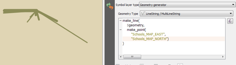
This is a good start. The width of the line indicates the number of pupils at each origin point.
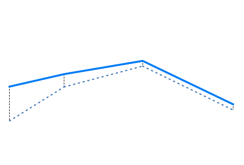
Curving the lines into pseudo-3D
So the lines start and end where we need. However, I wanted that 2.5D
effect — think of a parabola from start to end. This stumped me for some time.
I found the expression function offset_curve() but
after experimenting it seemed all offset and no curve.
Ross helped me out, as I was getting nowhere:
smooth( make_line( make_point( 'p_x','p_y'), make_point( abs('p_x'-'s_x')/2+ 'p_x'/2, abs('p_y'-'s_y')/2 + 'p_y'*2), make_point('s_x','s_y')), iterations:=4, offset:=0.25)
— Ross McDonald (@mixedbredie) March 14, 2018
I used the mid-point of line formula and then added the X Y coords to offset
The first problem had been that my lines only had vertices at start and end,
whereas at least one more point was required to offset and then curve. I
remembered this detail from his talk, together with his use of the
smooth() function. This is how it came out:
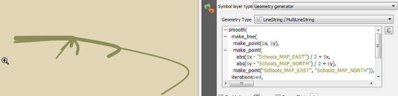
It wasn’t quite right, though. I realized that just about the only thing I knew about perspective is that verticals should remain vertical. In the image above, though, the expression offset the midpoint in both X and Y axes. I needed to remove the X offset.
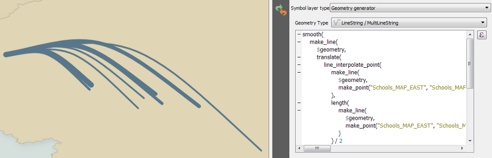
At about the same time, by splendid chance, the redoubtable Nathan Saylor mentioned an easier way to get the midpoint of a line:
Yay! I think I got it!
— Nathan 🎄🎅 (@gisn8) March 15, 2018
Data defined in the Placement section
Coordinate X/Y:
x/y( line_interpolate_point( $geometry , length( $geometry )*0.5))
Alignments: ';Center' and 'Half'
Rotation:
line_interpolate_angle( $geometry , length( $geometry )*0.5)+90 #GISTribe pic.twitter.com/4tjG1uKi6G
line_interpolate_point() was much more elegant.
These two techniques combined gave me the following expression:
smooth(
 make_line(
  $geometry,
  translate(
   line_interpolate_point(
    make_line(
     $geometry,
     make_point("Schools_MAP_EAST", "Schools_MAP_NORTH")
    ),
    length(
     make_line(
      $geometry,
      make_point("Schools_MAP_EAST", "Schools_MAP_NORTH")
     )
    ) / 2
   ),
   0,
   length(
    make_line(
     $geometry,
     make_point( "Schools_MAP_EAST",  "Schools_MAP_NORTH" )
    )
   ) / 2.5
  ),
  make_point( "Schools_MAP_EAST",  "Schools_MAP_NORTH" )
 ),
 iterations:=4,
 offset:=0.25
)
Now things were starting to come together:
An important thing to remember in any work of this kind is to step away for a moment and try to look at it with the eyes of a stranger. Doing so here made me realize that these lines could simply be interpreted visually as curved in the XY plane, not parabolas through the Z axis. The answer? Shadows, of course.
Because QGIS supports multiple symbol layers, this was easy to achieve. I created a second geometry generator under the first, and used the straight line code I had used earlier:
make_line(
 $geometry,
 make_point(
  "Schools_MAP_EAST",
  "Schools_MAP_NORTH"
 )
)
We now have a straight line connecting the points, as well as the curved one:

Nearly there. All that’s left is to add a draw effect to blur the shadow:
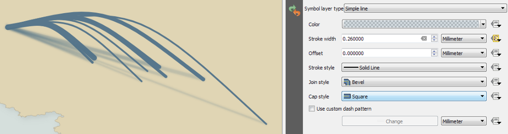
And that’s it. Add explanatory captions and some catchment borders, and the whole story is told.
I struggled with the caption text. I used QGIS layouts (formerly print composers) for the first time, and they work perfectly. The problem was with my own skill. Though a massive typography fan, I find it difficult, and this definitely doesn’t work on any level — type, size, or colour. No matter. As we’ll discuss when we look at the petition map, adding text at this stage was premature.
Remember the fundamental thing in this process: this is still a point dataset. If your underlying data changes, just amend the point geometries, and the geometry generators will dynamically style the new data in the same way. Amazing.
That’s not isometric — THIS is isometric
Happy with the journey map, the petition now needed some attention.
I have a weakness for isometric imagery. Be it Ant Attack, Fairlight, or Mobiles Disco, something about this aesthetic appeals to me. If done well, I believe it can have precisely that eye-catching effect I was after.
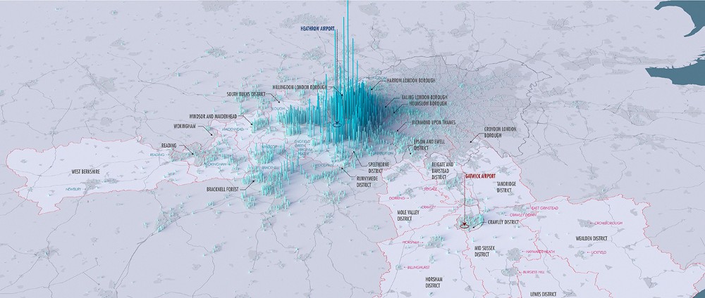
I remembered a map by Craig Taylor which took my breath away. It used isometrics for visual impact, and was of such eye-watering visual quality that I was excited to be able to try to build something in the same vein.
As well as a GIS professional, Craig is a full-on 3D artist, and while I understand the concepts of 3D imagery, and made some basic bits and pieces nearly twenty years ago, I didn’t want to plunge into learning a full 3D package such as Blender. I’m sure I’ll get the chance one day, but this was not the right project.
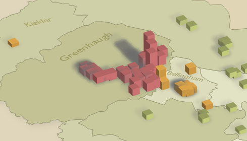
For the petition map, I saw an opportunity to use the QGIS 2.5D renderer. This seemed to produce the kind of synthetic isometric output I was after, and, again, I was keen to see how it stood up in real-life use.
Immediately, however, I had a problem. I couldn’t find the 2.5D renderer. After some panicked speculation that it might have been removed in QGIS 3 in favour of the new full 3D capabilities, I then remembered the explanation: the 2.5D renderer is only available for polygons, but my petition dataset is points.
I found the Processing algorithm “Rectangles, ovals, diamonds (fixed)”, which easily converted my point layer into a polygon layer, ready for the 2.5D renderer. But remember one of the principles to which I was trying to stick — try to make no change to the data, and do everything in the style. If I converted my points to polygons, I’d have to repeat that process as more signatures were added to the petition.
Points into squares
Time for another geometry generator. I dug into the source code for that Python Processing algorithm, and found the relevant part (edited down):
x = point.x()
y = point.y()
points = [
    (-xOffset, -yOffset),
    (-xOffset, yOffset),
    (xOffset, yOffset),
    (xOffset, -yOffset)
]
polygon = [
    [
        QgsPointXY(i[0] + x,
        i[1] + y) for i in points
    ]
]
Aside — I hate Python list comprehensions. This code creates squares around my points. However, this is isometric 2.5D, so we need to rotate by the magic angle of 30°. Happily, the processing algorithm has code for a rotated version:
xOffset = width / 2.0
yOffset = height / 2.0
phi = rotation * math.pi / 180
x = point.x()
y = point.y()
points = [
  (-xOffset, -yOffset),
  (-xOffset, yOffset),
  (xOffset, yOffset),
  (xOffset, -yOffset)
]
polygon = [
  [
    QgsPointXY(
      i[0] * math.cos(phi) + i[1] * math.sin(phi) + x,
      -i[0] * math.sin(phi) + i[1] * math.cos(phi) + y
    )
  ]
]
This is in Python, and I needed it in a QGIS expression. It looks like this:
make_polygon(
  make_line(
    make_point(
      -250 * cos(radians(60)) -
      250 * sin(radians(60)) + $x,
      250 * sin(radians(60)) -
      250 * cos(radians(60)) + $y
    ) ,
    make_point(
      -250 * cos(radians(60)) +
      250 * sin(radians(60)) + $x,
      250 * sin(radians(60)) +
      250 * cos(radians(60)) + $y
    ),
    make_point(
      250 * cos(radians(60)) +
      250 * sin(radians(60)) + $x,
      -250 * sin(radians(60)) +
      250 * cos(radians(60)) + $y
    ),
    make_point(
      250 * cos(radians(60)) -
      250 * sin(radians(60)) + $x,
      -250 * sin(radians(60)) -
      250 * cos(radians(60)) + $y
    )
  )
)
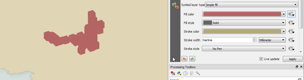
250 is half the height/width of the square, and 60 is 90° minus the isometric 30°. The result is starting to look good:
We are now at the point where the 2.5D renderer can do its magic, because we now have polygons for it to render. However, since our layer is still a point layer, the 2.5D renderer remains unavailable. We therefore need to look at the styling of another 2.5D layer, and manually apply its techniques to our geometry generator.
The 2.5D renderer creates three symbol layers: roof, walls, and shadow. It makes them using… geometry generators.
Roof
The roof geometry layer uses the following expressions (slightly simplified here):
translate(
  $geometry,
  cos(radians(90)) * eval( @qgis_25d_height ),
  sin(radians(90)) * eval( @qgis_25d_height )
)
This “raises” the roof away from the geometry on the “ground”. 90° is the direction to move it — I wanted it only moved vertically because vertical lines remain vertical in perspective (I’m not sure why the QGIS default is 70°).
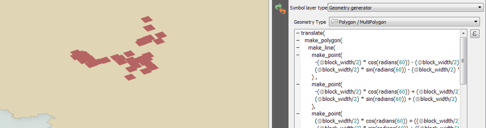
Combining this with our point-to-square code above gives us this:
translate(
  make_polygon(
    make_line(
      make_point(
        -(@block_width/2) * cos(radians(60)) -
          (@block_width/2) * sin(radians(60)) + $x,
        (@block_width/2) * sin(radians(60)) -
          (@block_width/2) * cos(radians(60)) + $y
      ),
      make_point(
        -(@block_width/2) * cos(radians(60)) +
          (@block_width/2) * sin(radians(60)) + $x,
        (@block_width/2) * sin(radians(60)) +
          (@block_width/2) * cos(radians(60)) + $y
      ),
      make_point(
        (@block_width/2) * cos(radians(60)) +
          (@block_width/2) * sin(radians(60)) + $x,
        -(@block_width/2) * sin(radians(60)) +
          (@block_width/2) * cos(radians(60)) + $y
      ),
      make_point(
        (@block_width/2) * cos(radians(60)) -
          (@block_width/2) * sin(radians(60)) + $x,
        -(@block_width/2) * sin(radians(60)) -
          (@block_width/2) * cos(radians(60)) + $y
      )
    )
  ),
  0, 1000
)
Note that I have removed the hard-coded 250 half-width of my squares, and
replaced it with @block_width/2, a layer variable.
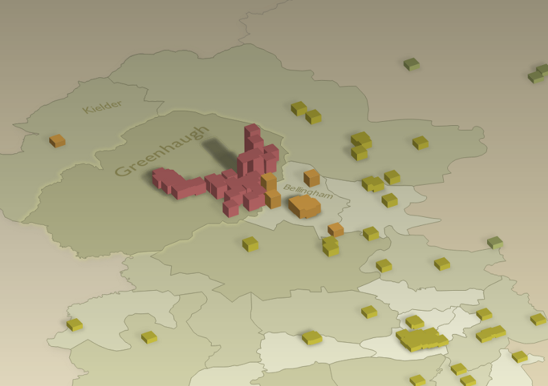
This makes all of our 2.5D rendered features the same height (1000 in the code above), which would be visually dull, and would make the use of 2.5D functionally redundant. Of course, I could try to aggregate the points and set the height accordingly, but I liked the idea of the height increasing as one approached Greenhaugh First School. Time for another expression to calculate the distance to the school
distance(
  $geometry,
  geometry(
    get_feature(
      'schools_5285d691_30cf_4e57_adab_1ca2dd449c8d',
      'SCH_NAME',
      'Greenhaugh First School'
    )
  )
)
This would place higher features further from the school, so we have to invert it. Also, because some of the signatories live extremely close to the school, some features would come out excessively high. To solve this, taking the square root of the inverse to create a logarithmic scale flattens the spread:
translate(
  make_polygon(
    make_line(
      make_point(
        -(@block_width/2) * cos(radians(60)) -
          (@block_width/2) * sin(radians(60)) + $x,
        (@block_width/2) * sin(radians(60)) -
          (@block_width/2) * cos(radians(60)) + $y
      ),
      make_point(
        -(@block_width/2) * cos(radians(60)) +
          (@block_width/2) * sin(radians(60)) + $x,
        (@block_width/2) * sin(radians(60)) +
          (@block_width/2) * cos(radians(60)) + $y
      ),
      make_point(
        (@block_width/2) * cos(radians(60)) +
          (@block_width/2) * sin(radians(60)) + $x,
        -(@block_width/2) * sin(radians(60)) +
          (@block_width/2) * cos(radians(60)) + $y
      ),
      make_point(
        (@block_width/2) * cos(radians(60)) -
          (@block_width/2) * sin(radians(60)) + $x,
        -(@block_width/2) * sin(radians(60)) -
          (@block_width/2) * cos(radians(60)) + $y
      )
    )
  ),
  0,
  sin(radians(90)) * 100000 / sqrt(
    distance(
      $geometry,
      geometry(
        get_feature(
          'schools_5285d691_30cf_4e57_adab_1ca2dd449c8d',
          'SCH_NAME',
          'Greenhaugh First School'
        )
      )
    )
  )
)
The roof is done. Onto the walls.
Walls
The QGIS 2.5D renderer creates the walls by extruding the polygon geometry:
order_parts(
  extrude(
    segments_to_lines($geometry),
    cos(radians(90)) * eval(@qgis_25d_height),
    sin(radians(90)) * eval(@qgis_25d_height)
  ),
  'distance(
    $geometry,
    translate(
      @map_extent_center,
      1000 * @map_extent_width * cos(radians(90 + 180)),
      1000 * @map_extent_width * sin(radians(90 + 180))
    )
  )',
  False
)
So, as with the roof, we need to replace $geometry
with our point-to-square geometry generator, remove the X axis shift
(verticals remain vertical), and replace
@qgis_25d_height with our distance-to-school
expression (order_parts also seems unnecessary in
this context, probably because we have a single shape used for all of our
features):
extrude(
  segments_to_lines($geometry),
  0,
  sin(radians(90)) * 100000 / sqrt(
    distance(
      $geometry,
      geometry(
        get_feature(
          'schools_5285d691_30cf_4e57_adab_1ca2dd449c8d',
          'SCH_NAME',
          'Greenhaugh First School'
        )
      )
    )
  )
)
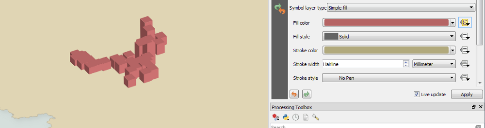
We now have some isometric walls:
I was baffled for a while as to why the walls had no shading. I eventually found how the 2.5D renderer does it: an expression in a data-defined override in the wall fill colour:
set_color_part(
  @symbol_color,
  'value',
  40 + 19 * abs(
    $pi - azimuth(
      point_n(
        geometry_n(
          $geometry,
          @geometry_part_num
        ),
        1
      ),
      point_n(
        geometry_n(
          $geometry,
          @geometry_part_num
        ),
        2
      )
    )
  )
)
Thankfully (from memory), this needed no edits, and could simply be applied to our layer:
Nearly there. The remaining issue is that one of the back walls is being
rendered on top of one of the front ones. To rectify this, I created a new
expression which, instead of creating a square from the feature point
geometry, created only the front two sides of the square by removing the
backmost point from the make_line() call:
make_line(
  make_point(
    -(@block_width/2) * cos(radians(60)) -
    (@block_width/2) * sin(radians(60)) + $x,
    (@block_width/2) * sin(radians(60)) -
    (@block_width/2) * cos(radians(60)) + $y
  ),
  make_point(
    (@block_width/2) * cos(radians(60)) -
    (@block_width/2) * sin(radians(60)) + $x,
    -(@block_width/2) * sin(radians(60)) -
    (@block_width/2) * cos(radians(60)) + $y
  ),
  make_point(
    (@block_width/2) * cos(radians(60)) +
    (@block_width/2) * sin(radians(60)) + $x,
    -(@block_width/2) * sin(radians(60)) +
    (@block_width/2) * cos(radians(60))+$y
  )
)
I then swapped this in to the extrude() function,
and the back face was thereby culled:
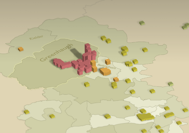
Now we are definitely getting somewhere!
Shadow
I was tempted to leave it at that, but the lack of shadow was slightly nagging at me. True to form, Craig then said exactly the same thing:
Can the qgis geom shader transform the pillars in such a way that you’d get long shadows? Might anchor the pillars and could look neat...
— Craig Taylor (@CraigTaylorGIS) March 20, 2018
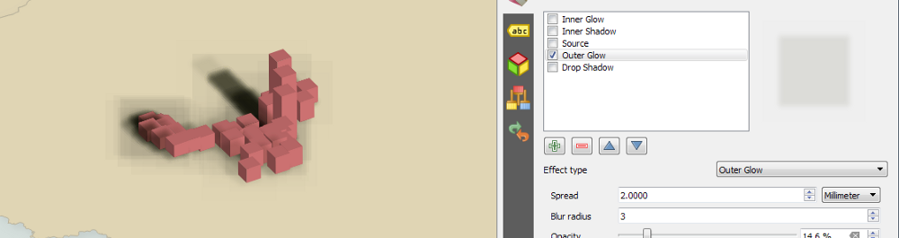
So I had to see what we could do. The QGIS 2.5D renderer adds shadows of a kind, but they are simply outer glows applied to a copy of the feature’s original geometry:
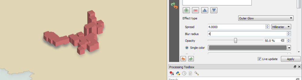
This works to a certain extent, but certainly wasn’t the “long shadows” Craig thought would help. I thought to myself, “You know what this needs? A geometry generator!”
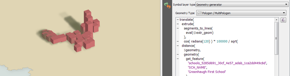
The walls geometry generator already extrudes the base square. All we need to do is extrude it in a different direction:
translate(
  extrude(
    segments_to_lines(
      eval(
        make_polygon(
          make_line(
            make_point(
              -(@block_width/2) * cos(radians(60)) -
              (@block_width/2) * sin(radians(60)) + $x,
              (@block_width/2) * sin(radians(60)) -
              (@block_width/2) * cos(radians(60)) + $y
            ),
            make_point(
              -(@block_width/2) * cos(radians(60)) +
              (@block_width/2) * sin(radians(60)) + $x,
              (@block_width/2) * sin(radians(60)) +
              (@block_width/2) * cos(radians(60)) + $y
            ),
            make_point(
              (@block_width/2) * cos(radians(60)) +
              (@block_width/2) * sin(radians(60)) + $x,
              -(@block_width/2) * sin(radians(60)) +
              (@block_width/2) * cos(radians(60)) + $y
            ),
            make_point(
              (@block_width/2) * cos(radians(60)) -
              (@block_width/2) * sin(radians(60)) + $x,
              -(@block_width/2) * sin(radians(60)) -
              (@block_width/2) * cos(radians(60)) + $y
            )
          )
        )
      )
    ),
    cos(radians(120)) * 100000 / sqrt(
      distance(
        $geometry,
        geometry(
          get_feature(
            'schools_5285d691_30cf_4e57_adab_1ca2dd449c8d',
            'SCH_NAME',
            'Greenhaugh First School'
          )
        )
      )
    ),
    sin(radians(120)) * 100000 / sqrt(
      distance(
        $geometry,
        geometry(
          get_feature(
            'schools_5285d691_30cf_4e57_adab_1ca2dd449c8d',
            'SCH_NAME',
            'Greenhaugh First School'
          )
        )
      )
    )
  ),
  -(@block_width/2) * cos(radians(60)),
  0
)
We then add a draw effect to hide the source and add an outer glow, using the multiply blend mode:
Ack. What are those bounding box artefacts? Hannes Kohlmann had the answer:
All the time when I try something more fancy =( Change the Drop Shadows blending mode to Normal or Addition. Draw Effects really need some polishing, they seem to be applied one by one which is not ideal.
— cartocalypse (@cartocalypse) March 20, 2018
Switching back from multiply to normal got rid of the problem. It’s a shame, but is probably unimportant for this design, with flat colours under the shadows. Nearly there now:
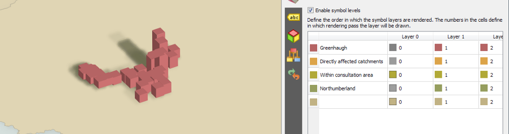
One remaining problem. The shadows cast by foreground features lie across background features. Obviously, this is technically correct, but traditional isometric imagery would normally place the shadows under all features. I guess this is so commonplace that the more lifelike alternative above just seems wrong to us. To me, anyway.
I failed to solve this for some time. Nyall Dawson had made a suggestion, but I had misinterpreted what he meant:
That's just what I was about to suggest... So now can't you use symbol levels to draw the shadows below the buildings?
— Nyall Dawson (@nyalldawson) March 20, 2018
Once the penny dropped, and I actually did use symbol levels, we were just about there. Ross and Tim Sutton rightly insisted that I tweak the shadow positioning:
Very nice! I think it needs another small 'skirt' shadow in the other direction to make it look like it is on the ground.
— Tim Sutton (@timlinux) March 21, 2018
After following their wise advice, I was happy to call this layer complete:
Matching projection to design
The isometric maps were looking pretty good now. However, a failure of the design was that the base polygons did not employ any styling to try to emulate the isometric effect. This results in the features appearing to float.
I realized there was a simple solution. The map was in British National Grid. Perhaps another projection would add a little perspective? Sure enough, switching to WGS84 did the trick.
Labels
My labelling wasn’t brilliant. Despite using a few sensible techniques (using a reasonable typeface, adding a multiply halo), the result just wasn’t really working.
I wondered about labelling the catchment polygons as though the label were drawn on the oblique plane of the base layers. However, there didn’t seem to be any way to achieve this with labels. Nyall, of course, set me straight:
Maybe.... Centroid fill with font marker symbol, char data defined to show polygon label, then use draw effects with a skew/rotation combination?
— Nyall Dawson (@nyalldawson) March 21, 2018
I’d never managed to think of any use for either centroid fills or font marker symbols, so I was intrigued. He wasn’t wrong:
I came unstuck initially, having not done all of this in map units, so the moment I zoomed, the labels totally lost their position and size relative to the polygons. Once that was sorted, though, this really seemed to be working quite nicely.
Post-production
I knew a couple of techniques which could really add to the visual appeal of these maps, and which would also emphasize the 2.5D design.
The first is as simple as can be — add a translucent gradient fill across the top of the whole image:
Already, you can see that the use of WGS84, together with the gradient overlay, really start to create an impression of depth.
I initially overlaid the gradient in GIMP, meaning I first had to rasterize the output. However, I then realized this gradient can easily be added in a QGIS layout, meaning I can still work within QGIS.
The last element, however, absolutely does require a raster source. I don’t know whether it’s best to call this tilt-shift or shallow depth-of-field. Regardless, the idea is to emulate a tightly focused photograph by adding blur above and below the area of attention in your image:
As with all these things, this effect can be overdone. As with colours, always err on the side of subtlety (I’m a demon for desaturating one’s palette).
Bad ideas
As you can see, I took all manner of wrong turns while making these maps. As well as the technical mistakes I’ve described above, I made some other design errors. I wondered about adding texture of some kind, and tried to work with the faintest of hillshades. When that didn’t work, I tried Anita Graser’s tutorial on generating tanaka contours. That didn’t work either.
At the end of the day, in any creative process, knowing when to stop is one of the hardest skills. I think I’m happy with the result.
Conclusion
So what did this process achieve? It demonstrated the power of geometry generators to achieve a complex design without decoupling it from the underlying data. When more people sign the petition, I just add them as extra rows in the CSV, and everything updates automatically (apart from the tilt-shift post-process). It really is amazing.
I got so much help during the process, as I hope I’ve demonstrated — apologies to anyone I’ve failed to mention. So many people know so much more than me, be it in the spatial/GIS camp or as cartographers. I’m incredibly grateful for all the feedback and problem-solving.
At the end of the day, these maps are just weapons in a fight against harmful changes — harmful to our families, and to our communities. The maps won’t win this battle for us. Let’s hope something does.
Epilogue
Out of pure vanity, and in a desperate quest for external validation, I submitted these two maps for the 2019 Geohipster calendar. To my utter delight, the petition map was selected.
I mention this here primarily out of said vanity, but also because submitting the maps forced me to look again at my overall titling/key text. With the notable exception of the bizarre colour I seem to have chosen for the title of the journeys map, I’m pleased with the results:
The text was all done in GIMP. This was by necessity, since it had to be laid over the post-processed map (this is why I said at the end of the description of the journey map above that labelling in QGIS had been premature). Had I not needed to post-process my map, everything you see could have been done in QGIS.
I hope you agree that the attention to good type on a map is vital for clarity and quality. Alongside poor colour, to my eye poor type is the most common weakness of a map.
Thanks very much to the Geohipster judging panel. It’s a big deal to have my mapping work endorsed by people vastly more capable in the discipline than me. I hope my vanity is to some degree offset by the extra exposure this also brings to Greenhaugh First School and its ongoing fight.
Tom “Mr February” Chadwin